.svg "Logo_black bg (1)")
Get Started
Settings
1. Header
The header is an important part of a website's design, as it is often the first thing that visitors see when they visit a website and it can help to guide them to the content they are looking for. The header of a website can help to make a good first impression and establish the overall look and feel of the site. Finally, the header can also help to establish the website's brand, as it often contains the website's logo and other branding elements.

How to set up a Global Header?
Edit page → Contents
To access the Global Header Module, choose the page, then go to the Contents tab and choose "Header" to open the Global Content Editor. You can also click on the header, then you will be also able to edit the Global Header.

Global Content → Logo, Primary Navigation, Language Switcher
Once you have accessed the global module, you will have the choice to set up Logo and static modules, such as Primary Navigation or Language Switcher.

Logo
By clicking on Logo you can:
- add the logo,
- change the alt text of your logo image,
- edit width and height,
- add the link URL for the logo and make it possible to open in a new tab when users are clicking.
Static modules → Primary Navigation
By clicking on Primary Navigation you can edit the existing menu or create a new one:
- give a name to the new menu,
- add Menu Items and select the Pages for them if it's needed,
- by clicking on Actions on the right near the Menu item, you can:
- add Child Item below,
- add Item below,
- clone Item,
- replace with Item without link,
- replace with Page link with URL parameter,
- replace with URL link,
- add to open link in new window.
The same actions above you can also do with the existing menu as well.

Static modules → Language Switcher
By clicking on Language Switcher you can choose a display mode that means the language of the text in the language switcher:
- Localized, the name of each language will display in that language.
- PageLang, the names of languages will display in that language.
- Hybrid, the combination of the two.

2. Header No Navigation
You can create a website header without a navigation menu by using the Global Content Editor. You can customize the header by removing the navigation menu and adding a logo.

How to set up a Global Header No Navigation?
Edit page → Contents
To access the Global Header Module No Navigation, choose the page, then go to the Contents tab and choose "Header No Navigation" to open the Global Content Editor. You can also click on the header, then you will be also able to edit the Global Header No Navigation.

Global Content → Logo
Once you have accessed the global module, you will have the choice to set up static modules that include Logo.
Logo
By clicking on Logo you can:
- add the logo,
- change the alt text of your logo image,
- edit width and height,
- add the link URL for the logo and make it possible to open in a new tab when users are clicking.
Check the short video below how to set up a Global Header No Navigation

3. Footer
The footer of a website is the bottom portion of a website. The footer is an important part of a website's design, as it can provide visitors with important information and links to useful pages, and help to guide them to additional content.

How to set up a Global Footer?
Edit page → Contents
To access the Global Footer, choose the page, then go to the Contents tab and choose "Footer" to open the Global Content Editor. You can also click on the footer, then you will be also able to edit the Global Footer.

Edit a Global Footer
Once you have accessed the global module, you will have the choice to set up columns with content. You can edit the content by adding or removing the text or other elements such as logos, social media, or legal terms.

The number of columns in your website's navigation menu will affect the layout of the footer module. The layout of the footer module is typically designed to match the overall layout of the website, so it is important to consider the number of columns in your navigation menu when designing the footer.
Style Section/Column:
You can set properties like:
- Alignment and spacing
- Background

Check the short video below how to set up a Global Footer

1. Blog Popular Post
Add a Blog Popular Post module to show your customers a list of the most popular posts on your blog.

Content Options:
You can set properties like:
- Selection of a blog
- Period of popular posts
- Number of posts

Styles Options:
Based on the selected device you can show or hide the visibility of specific modules:
- Show - displays the module added
- Hide - hides the module at the defined breakpoint

Style Section/Column:
You can set properties like:
- Alignment and spacing
- Background

2. Blog Recent Post
Add a Blog Recent Post module to show your customers a listing of the latest posts on your blog.

Content Options:
You can set properties like:
- Selection of a blog
- Number of posts

Styles Options:
Based on the selected device you can show or hide the visibility of specific modules:
- Show - displays the module added
- Hide - hides the module at the defined breakpoint

Style Section/Column:
You can set properties like:
- Alignment and spacing
- Background

3. Blog Subscription Banner
Use a Blog Subscription Banner module to notify your customers with new blog posts and recent updates.

Content Options:
You can set properties like:
- Content (RichText)
- Selection of a form

Styles Options:
Based on the selected device you can show or hide the visibility of specific modules:
- Show - displays the module added
- Hide - hides the module at the defined breakpoint

Style Section/Column:
You can set properties like:
- Alignment and spacing
- Background

4. Card
Add a Card module to present additional information. Cards are little rectangles full of images/illustrations and text that serve as entry points for more detailed information about your product/service.

Content Options:
1. You can set properties like:
- Items - the number of cards to display for each device and the space between them
- Cards
2. Individual elements are built on a repeater so you can easily add any number of Cards. You can also edit/clone/delete the elements. Each element has:
- Image
- Title
- Title heading type
- Content (RichText)

Styles Options:
You can set custom styles like:
- Image
- Title
- Content (RichText)
- Card - you can edit:
➡️ Background
➡️ Border
➡️ Corner
➡️ Spacing

Style Section/Column:
You can set properties like:
- Alignment and spacing
- Background

5. Careers Hub
Add a Careers Hub module to present information about open positions in your company - with active, full editable filters. Use rich text to easily describe job positions and link to dedicated application forms.

Content Options:
1. Click Settings and edit:
- Layout - enter the number of items to display for each device
- Items per page - the number of items you want to have on the page
- Pagination ID
- Gap - a distance between items
- No results text - write the message you want the users to see
- Scroll offset - regulates scrolling to the top of search results

2. Click Filters and Searching and choose:
- Select Field - add/edit/clone/delete the fields.
➡️ Edit the field:
✅ Filter name - change the filter name
✅ Label - change the name of the field
✅ Select - add/edit/clone the possible options of your filter → edit:
👉 Label - change the name of the filter option. In this field, we can use special characters, e.g. “Text & Image”
👉 Value - is the reset filter. For the filter option “All” we should give * as a value. In this field we can’t use special characters, e.g. we must enter here “text-and-image”
👉 Active - it performs the function of selecting the active filter
- Search:
➡️ Label - change the name of the field
➡️ Active - make the search field visible or not
➡️ Placeholder - the alternative text inside the field

3. Individual elements are built on a repeater so you can easily add any number of Items. You can also edit/clone/delete the elements. Each element has:
- Categories
- Content (RichText)
- Link information

Styles Options:
You can set custom styles like:
- Resource Item:
➡️ Spacing
➡️ Border
➡️ Background color - Navigation Inputs:
➡️ Font
➡️ Spacing
➡️ Border
➡️ Background color
- Pagination:
➡️ Font
➡️ Item margin
➡️ Item min width
➡️ Spacing
➡️ Border radius
➡️ Color and color hover for pagination elements
➡️ Border and border hover for pagination elements
➡️ Background color and background color hover for pagination boxes
➡️ Position

Style Section/Column:
You can set properties like:
- Alignment and spacing
- Background

6. Case Study Carousel
Add a Case Study Carousel module to add various content types and add/remove sections. Specify the number of elements (which can be different for desktop, tablet, and mobile screens).

Content Options:
1. Click Settings and edit:
- Items - the number of cards to display for each device
- Space between slides
- Autoplay - video will play as soon as the page loads
- Loop - video will play continuously in a loop
- Navigation:
➡️ Color
➡️ Size - Pagination:
➡️ Active - make the pagination visible or not
➡️ Color and color active
➡️ Size
➡️ Space between
➡️ Offset top - the distance between pagination and case studies cards
2. Individual elements are built on a repeater so you can easily add any number of Case Studies. You can also edit/clone/delete the elements. Each element has:
- Image type
- Image
- Alt text
- Width and height
- Background height
- Content (RichText)
- Link information

Styles Options:
You can set custom styles like:
- Spacing
- Border - style, color, width, and radius
- Background color

Style Section/Column:
You can set properties like:
- Alignment and spacing
- Background

7. Custom Button
Add a Custom Button module to help your customers take actions. You can easily edit and customize the button text.

Content Options:
You can set properties like:
- Link to type
- URL
- Open link in new window
- Link type
- Button text
- Modal ID

Styles Options:
You can set custom styles like:
- Font
- Background
- Border
- Corner
- Spacing
- Alignment

Style Section/Column:
You can set properties like:
- Alignment and spacing
- Background

8. FAQ
Add an FAQ module to provide clear and informative information. An FAQ module will save your company’s time in answering the customers’ questions about your products, services, terms of use, website’s work, etc.

Content Options:
1. Click Settings and edit:
- FAQ title
- Max width of the container
- Accent color
2. Individual elements are built on a repeater so you can easily add any number of FAQ Items. You can also edit/clone/delete the elements. Each element has:
- Title
- Content (RichText)


Styles Options:
Based on the selected device you can show or hide the visibility of specific modules:
- Show - displays the module added
- Hide - hides the module at the defined breakpoint

Style Section/Column:
You can set properties like:
- Alignment and spacing
- Background

9. Form On Modal
Add a Form On Modal module to create a pop-up form. Custom Button module will help to add possibility to trigger Modal Form module.

Content Options:
1. Click Settings to write Form ID.
2. Click Rich text and customize it.
3.Click Form and select the needed form.

Styles Options:
You can set custom styles like:
- Background color
- Modal:
➡️ Spacing
➡️ Border radius
➡️ Max width
➡️ Background color
➡️ Text alignment

Style Section/Column:
You can set properties like:
- Alignment and spacing
- Background

10. Hero Banner
Add a Hero Banner module to display big bold introduction texts/images or even video to welcome your customers. A hero banner presents the main message, along with additional information and a clear action, if needed. It's a good way to inform your customers about the main goal of a certain page, such as registering to an event or applying for something.

Content Options:
You can set properties like:
- Background type
- Content (RichText)

Styles Options:
You can set custom styles like:
1. Background:
- Image size
- Image alignment
- Banner mask
- Mask type

2. Content:
- Position
- Min height
- Max width
- Text theme

Style Section/Column:
You can set properties like:
- Alignment and spacing
- Background

11. Interactive Worldwide Map
Add an Interactive Worldwide Map module to add content for ~ 200 countries. Bonus, you can color the map as you wish, so it matches your brand guide.

Content Options:
1. Click Settings and edit:
- Font
- Map background color
- Country color
- Country border color
- Country hover color
- Map max width

2. Individual elements are built on a repeater so you can easily add any number of Countries. You can also edit/clone/delete the elements. Each element has:
- Choice - select the country
- Text


Styles Options:
Based on the selected device you can show or hide the visibility of specific modules:
- Show - displays the module added
- Hide - hides the module at the defined breakpoint

Style Section/Column:
You can set properties like:
- Alignment and spacing
- Background

12. Logo Carousel
Add a Logo Carousel module to add logos of companies. Specify the number of elements (which can be different for desktop, tablet, and mobile screens).

Content Options:
1. Click Settings and edit:
- Items - the number of cards to display for each device
- Space between slides
- Autoplay - video will play as soon as the page loads
- Loop - video will play continuously in a loop
- Navigation:
➡️ Color
➡️ Size - Pagination:
➡️ Active - make the pagination visible or not
➡️ Color and color active
➡️ Size
➡️ Space between
➡️ Offset top - the distance between pagination and case studies cards

2. Individual elements are built on a repeater so you can easily add any number of Logos. You can also edit/clone/delete the elements. Each element has:
- Image
- Alt text
- Width and height

Styles Options:
Based on the selected device you can show or hide the visibility of specific modules:
- Show - displays the module added
- Hide - hides the module at the defined breakpoint

Style Section/Column:
You can set properties like:
- Alignment and spacing
- Background

13. Menu
Add a Menu module to display a menu and all relative menu items in a particular module position on your site.

Content Options:
1. Click Menu and choose:
- Menu from the list:
➡️ Edit the existing menu
➡️ Create a new one

Styles Options:
Based on the selected device you can show or hide the visibility of specific modules.
- Show - displays the module added
- Hide - hides the module at the defined breakpoint

Style Section/Column:
You can set properties like:
- Alignment and spacing
- Background

14. Pillar Content
Add a Pillar Content module to create some topic pillars (Parent 1, 2, 3...) and clusters (Item 1, 2, 3...). Use this module when you need to organize a big amount of information for the users.

Content Options:
1. Click Menu to edit the menu content.
2. Individual elements are built on a repeater so you can easily add any number of Sections. You can also edit/clone/delete the elements. Each element has:
- Title
- Section ID
- Preview text
- Content

Styles Options:
Based on the selected device you can show or hide the visibility of specific modules.
- Show - displays the module added
- Hide - hides the module at the defined breakpoint

Style Section/Column:
You can set properties like:
- Alignment and spacing
- Background

15. Pricing Card
Add a Pricing Card module to your page so that you can effectively showcase your different product pricing options.

Content Options:
You can set properties like:
- Product tier
- Product tier heading type
- Product description
- Features list icon
- Features
- Price
- Price timeframe
- Link to type
- URL
- Open link in new window
- Link type
- Button text

Styles Options:
You can set custom styles like:
- Product tier
- Product description
- Features
- Price
- Button
- Card

Style Section/Column:
You can set properties like:
- Alignment and spacing
- Background

16. Resources Hub
Add a Resources Hub module to present all of your content: ebooks, whitepapers, case studies, reports, webinars, etc. Create your own filters and tailor available options. The Resources Hub module ideally fits with the Content Type, but you can also use it with Authors, Publishing Years, Industries, Personas, and so on.

Content Options:
1. Click Settings and edit:
- Layout - enter the number of items to display for each device
- Items per page - the number of items you want to have on the page
- Gap - a distance between items
- No results text - write the message you want the users to see
- Scroll offset - regulates scrolling to the top of search results
2. Click Filters and Searching and choose:
- Select Field - add/edit/clone/delete the fields.
➡️ Edit the field:
✅ Filter name - change the filter name
✅ Label - change the name of the field
✅ Select - add/edit/clone the possible options of your filter → edit:
👉 Label - change the name of the filter option. In this field, we can use special characters, e.g. “Text & Image”
👉 Value - is the reset filter. For the filter option “All” we should give * as a value. In this field we can’t use special characters, e.g. we must enter here “text-and-image”
👉 Active - it performs the function of selecting the active filter - Search:
➡️ Label - change the name of the field
➡️ Active - make the search field visible or not
➡️ Placeholder - the alternative text inside the field
3. Individual elements are built on a repeater so you can easily add any number of Items. You can also edit/clone/delete the elements. Each element has:
- Categories
- Image type
- Image
- Alt text
- Width and height
- Background height
- Content (RichText)
- Link information

Styles Options:
You can set custom styles like:
- Resource Item:
➡️ Spacing
➡️ Border - style, color, width, radius
➡️ Background color - Navigation Inputs:
➡️ Font
➡️ Spacing
➡️ Border - style, color, width, radius
➡️ Background color - Pagination:
➡️ Font
➡️ Item margin
➡️ Item min width
➡️ Spacing
➡️ Border radius
➡️ Color and color hover for pagination elements
➡️ Border and border hover for pagination elements
➡️ Background color and background color hover for pagination boxes
➡️ Position

Style Section/Column:
You can set properties like:
- Alignment and spacing
- Background

17. Rich Text Carousel
Add a Rich Text Carousel module to demonstrate your customer's testimonials, quotes, etc.

Content Options:
1. Click Settings and edit:
- Items - the number of cards to display for each device
- Space between slides
- Autoplay - video will play as soon as the page loads
- Loop - video will play continuously in a loop
- Navigation:
➡️ Color
➡️ Size - Pagination:
➡️ Active - make the pagination visible or not
➡️ Color and color active
➡️ Size
➡️ Space between
➡️ Offset top - the distance between pagination and case studies cards
2. Individual elements are built on a repeater so you can easily add any number of Rich Text. You can also edit/clone/delete the elements. Each element has:
- Rich text → you can put headline, image, icon, and description

Styles Options:
Based on the selected device you can show or hide the visibility of specific modules.
- Show - displays the module added
- Hide - hides the module at the defined breakpoint

Style Section/Column:
You can set properties like:
- Alignment and spacing
- Background

18. Search Input
Add a Search Input module and let the users search for a specific content on your Blog page.

Content Options:
You can set properties like:
- Label text
- Placeholder text
- Include search button
- Search results include

Styles Options:
Based on the selected device you can show or hide the visibility of specific modules.
- Show - displays the module added
- Hide - hides the module at the defined breakpoint

Style Section/Column:
You can set properties like:
- Alignment and spacing
- Background

20. Timeline
Add a Timeline module to provide a logical, clean way to tell your story. With a timeline, you can present information more effectively with an easy to understand chronological order design.

Content Options:
1. Click Settings and choose an animated option for your cards.
2. Individual elements are built on a repeater so you can easily add any number of Cards. You can also edit/clone/delete the elements. Each element has:
- Left image
- Alt text
- Size
- Width and height
- Right text for your content

Styles Options:
You can set custom styles like:
- Card:
➡️ Spacing: padding
➡️ Border: style, color, width, radius, background color - Timeline:
➡️ Line: color, width, horizontal mobile offset
➡️ Dot: background color, border information, horizontal and vertical offset

Style Section/Column:
You can set properties like:
- Alignment and spacing
- Background

21. Video Tab Panel
Add a Video Tab Panel module with a description and progress bar. Use the accordion feature to upload several videos and show one at a time with an additional description and progress bar that shows the video status.

Content Options:
1. Click Settings and edit:
- Font
- Layout type
- Reverse layout
- Max width of your content
- Accent color for the progress bar
2. Click Content (RichText) and add:
- Title, text, videos, images, tables, icons, CTA, anchor, horizontal line, emoji, horizontal line, non-breaking space, and special characters.
3. Click Video Settings and edit:
- Video size
- Video margin top
4. Individual elements are built on a repeater so you can easily add any number of Items. You can also edit/clone/delete the elements. Each element has:
- Title
- Description
5. Click Bottom Content and edit the concluding section:
- Content (RichText)

Styles Options:
Based on the selected device you can show or hide the visibility of specific modules.
- Show - displays the module added
- Hide - hides the module at the defined breakpoint

Style Section/Column:
You can set properties like:
- Alignment and spacing
- Background
1. Home
A Homepage is the main landing page of a website that is designed to provide an overview of the business or organization, as well as information about products or services that are offered.

The homepage can also include calls-to-action (CTA) that encourage visitors to take specific actions, such as signing up for a newsletter or scheduling a consultation. Additionally, it can include links to other pages on the website, such as the About Us page or the Contact Us page.
6Minded theme includes the Homepage that allows you to create a custom page that can include various sections like:
- Hero banner
- Logo corosouel
- Case studies carousel
- Rich text section
- Multi-column section
- Recent or popular articles section
- Testimonials section
- Interactive map
- CTA banner
- Video section


2. Services
The Services page is a page that provides information about the specific services that a business or organization offers.

6Minded theme includes the Services page which is an overview of the services offered, along with details about the features and benefits of each service.

It may also include images, videos, or graphics that help to explain or demonstrate the services. The page can be divided into different sections or categories, such as consulting, training, or support services.
Each service may have a separate page or section to provide more detailed information, such as pricing and availability.

The page may also include customer testimonials or case studies that provide examples of how the company has helped other businesses or organizations with similar needs.
Additionally, the page may also include calls-to-action (CTA) such as "Contact Us" or "Learn More" buttons that direct visitors to other pages on the website or to a form to contact the company for more information.

3. Features
A Features page lists and describes the features and capabilities of a product or service offered by the company. This page is usually linked in the website's main navigation or on the homepage, making it easily accessible for visitors.

6Minded theme includes the Features page that allows you to create a custom page that can include various sections like:
- A summary of the key features and benefits of the product or service
- Detailed descriptions of each feature, with images and videos
- Customer testimonials or case studies that showcase how the product or service has been used successfully
- Links to additional resources, such as support articles or tutorials

The Features page is a great way to showcase the value of your product or service to potential customers and help them understand how it can meet their needs.

It is an important page that helps visitors understand what the company offers and how it can benefit them. It can be used to educate the visitors, and guide them to take the next step, such as signing up for a free trial, or scheduling a demo.

4. Benefits
A Benefits page on a website is a page that highlights the advantages or perks that a company or organization offers to its customers, employees, or members.

The purpose of the benefits page is to inform visitors about the value that the company or organization can provide to them.
6Minded theme includes the Benefits page that can be used for different types of companies.

In general, a benefits page can include elements such as text, images, and videos to inform and showcase the different benefits offered by the company or organization. Some benefits page also includes a section for testimonials or reviews from existing customers, members, or employees to demonstrate the satisfied customers, which can be a great way to build trust and credibility with potential customers or members.

5. Industries
An Industries page provides information about the specific industries that a business or organization serves.

The page can provide an overview of the different industries that the company works with, and it can also include case studies or testimonials from customers in those industries.

The page may also highlight the specific products or services that the company offers to those industries, and it may include calls-to-action (CTA) such as "Contact Us" or "Learn More" buttons that direct visitors to other pages on the website or to a form to contact the company.

This page is usually a part of website which is designed to provide more information about the company's offerings and how it can help specific business or industries.
6. Request Demo
A Request Demo page allows website visitors to request a demonstration of a product or service offered by a business or organization.
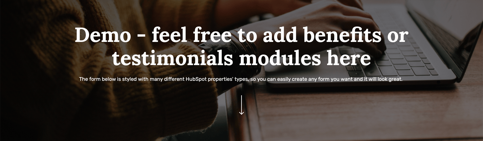
6Minded theme includes a form that visitors can fill out to request a demo, and it may include fields such as name, email, company name, phone number, and a message field where visitors can provide additional information about their specific needs or questions.

The page may also include a call-to-action (CTA) button, such as "Submit" or "Request a Demo", that visitors can click to submit their request. The information provided on the form is typically sent to the sales or customer success team of the business for follow-up.
The page may also include information about the product or service being demonstrated, as well as the benefits and features of the product or service.
7. Pricing
A Pricing page displays the different pricing options available for a product or service offered by a business or organization.

6Minded theme includes the Pricing page to provide visitors with a clear and easy-to-understand overview of the pricing plans that are available, as well as the features and benefits that are included with each plan.
It can include different sections such as "Basic", "Pro", "Enterprise" etc. that outlines the different features and pricing associated with each plan.

It may also include calls-to-action (CTA) such as "Sign Up" or "Learn More" buttons that direct visitors to other pages on the website or to a form to contact the company for more information.
Additionally, the page may also include trust badges, testimonials to build trust with website visitors, and FAQs to give answers to the most popular questions.

8. Blog Listing Classic
6Minded theme includes the Blog Listing Classic page that has the next elements:
- Search bar: that allows searching through a collection of blog posts.
- Categories: a way to organize and filter the blog posts by topic.
- Thumbnail: an image that represents the post, often used as the post's main image.
- Date: the date the post was published.
- Post title: a list of the titles of the blog posts, linking to the full post.
- Post excerpt: a brief summary or excerpt from each post, providing a preview of the content.
- Pagination: a way to navigate through multiple pages of blog posts, usually through numbered page links or next/previous buttons.
- Popular articles: the list of the most read articles on the blog.
- Subscription banner: the user can subscribe to the newsletter.


9. Blog Listing Dynamic
A Blog Listing is a page that displays a list of blog posts or articles in a specific order, usually in reverse chronological order.

6Minded theme includes the Blog Listing Dynamic page that has the next elements:
- Categories: a way to organize and filter the blog posts by topic.
- Thumbnail: an image that represents the post, often used as the post's main image.
- Date: the date the post was published.
- Post title: a list of the titles of the blog posts, linking to the full post.
- Post excerpt: a brief summary or excerpt from each post, providing a preview of the content.
- Button "Load More": to show more blog posts.
- Subscription banner: the user can subscribe to the newsletter.


10. Blog Post
A Blog Post on a website is a written or multimedia piece of content that is published on a website and intended to inform, educate, or entertain the website's audience.

Blog posts on HubSpot can be used to attract visitors to a website, educate and engage with potential customers, and increase search engine rankings. The platform allows users to easily create, optimize and publish blog post, track the performance of the post and integrate with other marketing tools like email, social media, and analytics.

6Minded theme includes the Blog Post page that has the next elements:
- Categories: a way to organize and filter the blog posts by topic.
- Post title: name of the blog article.
- Date: the date the post was published.
- Reading time: how much time the user will spend reading the article.
- Sharing on social media: the option to share a blog post on social media.
- Thumbnail: an image that represents the post, often used as the post's main image.
- Description text: whole text of the article.
- Progress bar: that shows the progress of reading.
- Right panel with tags, popular articles, and subscription banner.
- Related articles: the list of articles that fits some topic.
- Subscription banner: the user can subscribe to the newsletter.

11. About Us
An About page is a webpage that provides information about the company or individual that runs it.
It may include information such as the mission or purpose of the company, the history of the company or individual, and the people who run it.
Additionally, it may also include contact information, such as an email address or phone number, for the website's visitors to get in touch.

6Minded theme includes an About page template that can be used as a starting point for creating an about page for a website.

The template includes placeholder text and images that can be replaced with specific information for the website. Some common elements that might be included in an About page template are:
- An introduction: a brief overview of the website or organization, including its mission or purpose.
- History: a section that provides background information on the origins of the website or organization.
- Team: a section that includes biographical information and photos of key team members or staff.
- Contact: a section that includes contact information such as an email address, phone number, and physical address.

It's also common that the About page template includes images, such as logos, photographs, or illustrations to make the page more visually appealing and highlight what is the organization/company all about.

12. Company History
A Company History page allows businesses to share the story of their company's evolution and milestones on their website.

6Minded theme includes the Company History page can be used to showcase the company's heritage, its key achievements, and the people who have been instrumental in its growth.

It can be presented in a variety of formats, such as a timeline, an interactive graphic, or a written narrative.
The page can also include multimedia elements such as images, videos, and audio to make the content more engaging and informative.

The company history page can be a powerful tool for building trust and credibility with potential customers and partners, and for creating a sense of connection with the company's past, present, and future.

13. Careers Hub
The Careers Hub page allows businesses to create and manage job listings, as well as track and communicate with job applicants all in one place.

6Minded theme includes the Careers Hub page that allows companies to create a dedicated careers page on their website, where they can post job listings, accept applications, and manage the recruitment process.

It also includes analytics to measure the performance of job postings, and built-in communication tools to keep track of job applicants and communicate with them throughout the hiring process.

Additionally, it can be integrated with other tools like ATS, CRM and marketing automation, to create a seamless workflow for recruiting and hiring.
14. Resources
A Resources Hub page serves as a central location for a variety of resources and educational materials related to a business or organization's products or services.

6Minded theme includes a Resources Hub page that can include a variety of content types such as blog posts, whitepapers, e-books, webinars, case studies, infographics, and more.

The resources hub can be organized into different categories or sections, such as by industry, product, or topic, to make it easy for visitors to find the information they need.
The resources hub can also include a search bar that allows visitors to search for specific content. The goal of this page is to provide website visitors with a wealth of information that can help them make informed decisions about a product or service and to establish the company as a thought leader in its industry.
Additionally, the page may also include calls-to-action (CTA) such as "Sign up for our newsletter" or "Download this whitepaper" to encourage visitors to take additional actions.

15. Case Studies
The Case Studies page is a feature that allows businesses to create, manage, and publish case studies on their website.

6Minded theme includes the Case study page that illustrates how a product or service has been used to solve a problem or achieve a specific goal.

The case study page allows businesses to create and publish case studies in an organized way on their website. It also allows tracking the performance of the case studies by providing analytics on the views, clicks, and conversion rate.

In addition, it can be integrated with other tools like CRM, marketing, and sales to make the process more efficient. It is a powerful way to showcase the value of a product or service and build trust with potential customers.
16. Lead Magnets Landing Page
Lead Magnets Landing Page allows the creation of all lead magnet download pages and generation of MQLs. Whitepapers, Reports, Infographics, Webinars, Videos, Live Demos, Podcasts - whatever you want.

6Minded theme includes the Lead Magnets Landing Page, so you can provide information about some of your resources. It can have the next elements:
- Hero banner with download form: to present the main message and encourage users to do some action (download/register etc.)
- Rich text section: to describe specific information.
- Multi-column section: to provide more details.
- Testimonials section: to show feedback from happy clients.

17. Contact
The Contact page contains contact information and a contact form for visitors to fill out and submit.

6Minded theme includes the Contact page that allows you to create a custom contact page with various sections like:
- Contact information: including your company's address, phone number, and email address.
- Contact form: allowing visitors to fill out and submit a form to contact you.
- Map: showing the location of your company.
- Social media links: linking to your company's social media profiles.
- Additional sections: like business hours, or frequently asked questions.

The contact page can be customized to match the design of your website. The contact form on the page can be configured to send data to the CRM, sales, or service tools. This way, you can track and manage the leads generated from the contact form easily.
It is a great way for website visitors to easily find and reach out to the company for any inquiry or support, and for businesses to capture leads and manage them through the CRM.
1. 404 Error
2. 500 Error
3. Password Prompt
4. Email Subscription Preferences
5. Email Backup Unsubscribe
6. Email Subscription Confirmation
7. Search Results
8. Membership Registration
9. Membership Login
10. Reset Password
11. Reset Password Request
12. Header
The header is an important part of a website's design, as it is often the first thing that visitors see when they visit a website and it can help to guide them to the content they are looking for. The header of a website can help to make a good first impression and establish the overall look and feel of the site. Finally, the header can also help to establish the website's brand, as it often contains the website's logo and other branding elements.
How to set up a Global Header?
Edit page → Contents
To access the Global Header Module, choose the page, then go to the Contents tab and choose "Header" to open the Global Content Editor. You can also click on the header, then you will be also able to edit the Global Header.
Global Content → Logo, Primary Navigation, Language Switcher
Once you have accessed the global module, you will have the choice to set up Logo and static modules, such as Primary Navigation or Language Switcher.
Logo
By clicking on Logo you can:
- add the logo,
- change the alt text of your logo image,
- edit width and height,
- add the link URL for the logo and make it possible to open in a new tab when users are clicking.
Static modules → Primary Navigation
By clicking on Primary Navigation you can edit the existing menu or create a new one:
- give a name to the new menu,
- add Menu Items and select the Pages for them if it's needed,
- by clicking on Actions on the right near the Menu item, you can:
- add Child Item below,
- add Item below,
- clone Item,
- replace with Item without link,
- replace with Page link with URL parameter,
- replace with URL link,
- add to open link in new window.
The same actions above you can also do with the existing menu as well.
Static modules → Language Switcher
By clicking on Language Switcher you can choose a display mode that means the language of the text in the language switcher:
- Localized, the name of each language will display in that language.
- PageLang, the names of languages will display in that language.
- Hybrid, the combination of the two.
13. Header No Navigation
You can create a website header without a navigation menu by using the Global Content Editor. You can customize the header by removing the navigation menu and adding a logo.
How to set up a Global Header No Navigation?
Edit page → Contents
To access the Global Header Module No Navigation, choose the page, then go to the Contents tab and choose "Header No Navigation" to open the Global Content Editor. You can also click on the header, then you will be also able to edit the Global Header No Navigation.
Global Content → Logo
Once you have accessed the global module, you will have the choice to set up static modules that include Logo.
Logo
By clicking on Logo you can:
- add the logo,
- change the alt text of your logo image,
- edit width and height,
- add the link URL for the logo and make it possible to open in a new tab when users are clicking.
Check the short video below how to set up a Global Header No Navigation
14. Footer
The footer of a website is the bottom portion of a website. The footer is an important part of a website's design, as it can provide visitors with important information and links to useful pages, and help to guide them to additional content.
How to set up a Global Footer?
Edit page → Contents
To access the Global Footer, choose the page, then go to the Contents tab and choose "Footer" to open the Global Content Editor. You can also click on the footer, then you will be also able to edit the Global Footer.
Edit a Global Footer
Once you have accessed the global module, you will have the choice to set up columns with content. You can edit the content by adding or removing the text or other elements such as logos, social media, or legal terms.
The number of columns in your website's navigation menu will affect the layout of the footer module. The layout of the footer module is typically designed to match the overall layout of the website, so it is important to consider the number of columns in your navigation menu when designing the footer.
Style Section/Column:
You can set properties like:
- Alignment and spacing
- Background
Check the short video below how to set up a Global Footer
19. Social Follow
Add a Social Follow module that lets you display social media icons linking to your social media accounts.
Content Options:
Individual elements are built on a repeater so you can easily add any number of Social Links. You can also edit/clone/delete the elements. Each element has:
Styles Options:
You can set custom styles like:
Style Section/Column:
You can set properties like: